Updated Focus Styles
TL;DR:We've released new focus styles to improve the accessibility of FT Group products which use Origami. These changes will roll out gradually as teams [pull in the latest Origami component releases](#upgrade-your-project). We're treating this as a minor release and there should be no code changes required to upgrade. However, this is a broad, global change and we encourage teams to [test focus states](#upgrade-your-project) within their projects – the Origami team are here to help if you have any questions, or spot any issues.
What are focus styles?
People browse the web in a number of different ways depending on their preference and access needs. For example some people do not use a mouse but instead use only their keyboard, or other input devices. Focus styles allow people to know which element they’re on when moving around a page. Sara Soueidan’s guide to focus indicators explains this well and includes a screen recording of focus states in action if you would like to learn more.
Why are focus styles being updated?
In a number of places our focus state styles lack contrast and are difficult to see; particularly when the focused element has a dark background colour, or is on a dark page background. This makes FT Group products difficult to use in places and is a particular barrier to users with certain disabilities.
This issue was highlighted through an audit provided by the Digital Accessibility Centre and must be fixed in order for ft.com to be accredited accessible as outlined in the FT’s accessibility commitments – however both user facing products as well as internal tools and documentation are affected.
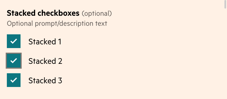
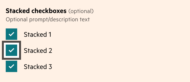
What do the new styles look like?
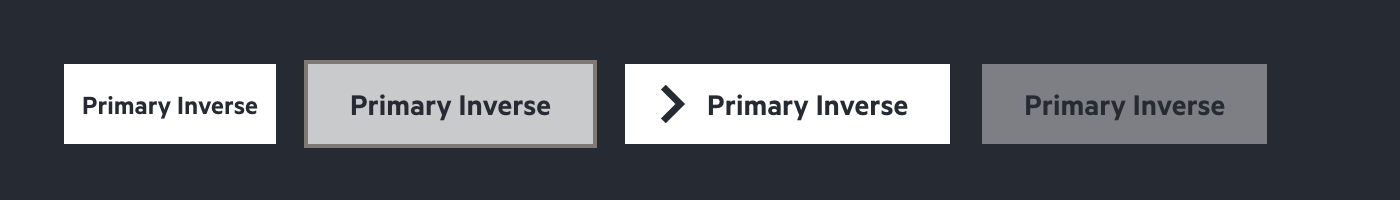
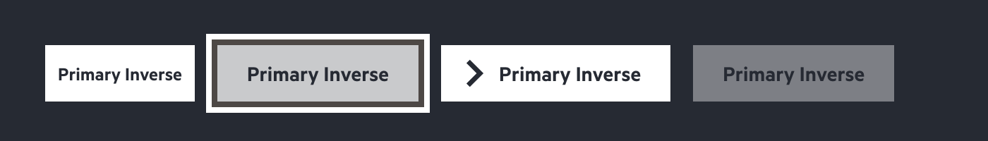
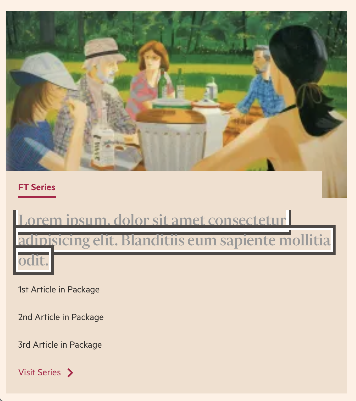
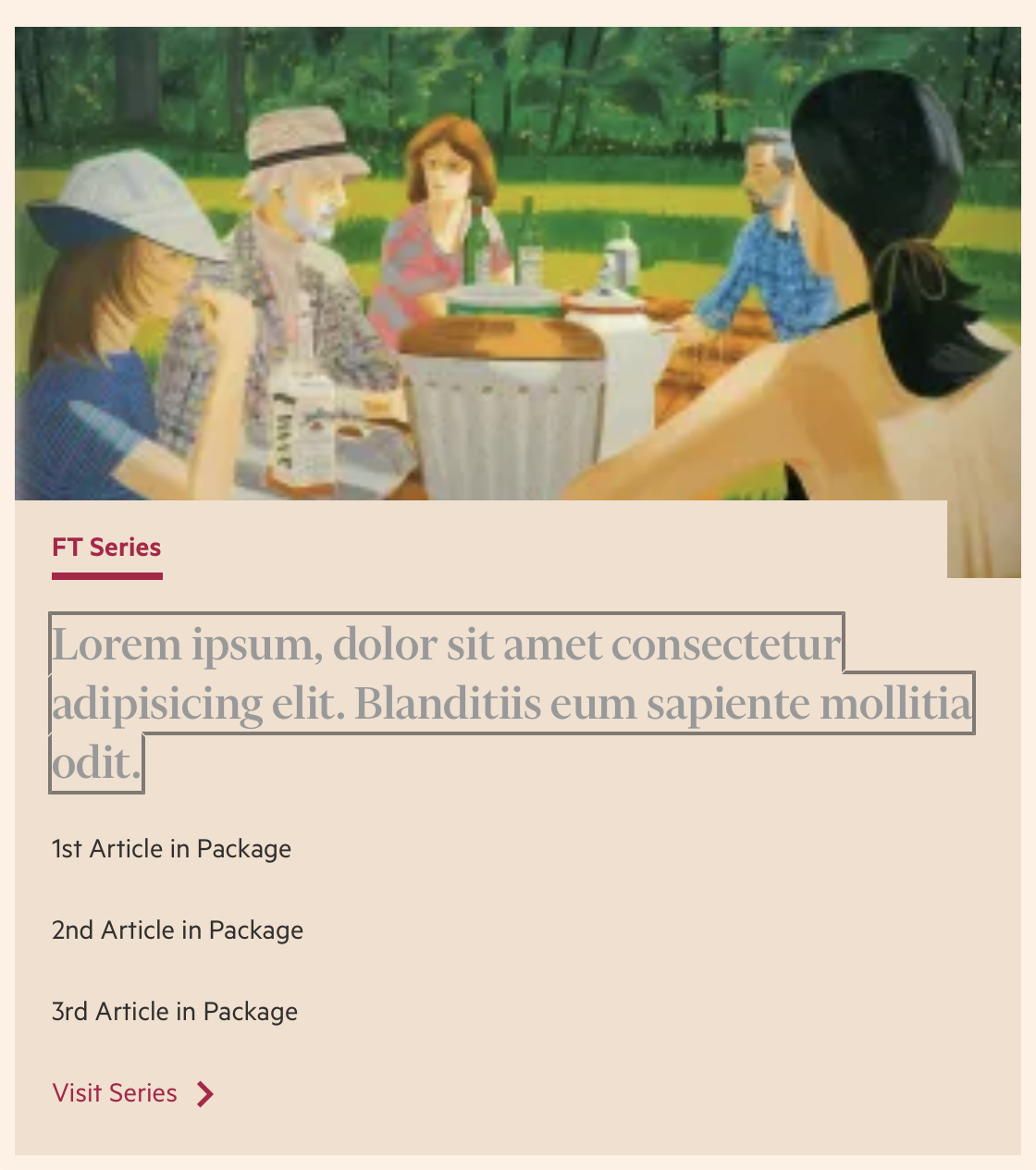
Buttons and inputs will now display a new 2 band outline when focused. One band is near-black (black-70) and the other white, ensuring that at least one band provides sufficient contrast. Focus state styles for other elements, including links, will remain unchanged as the new approach breaks down when applied to multi-line text, as shown below.
Upgrade Your Project
We’re treating this as a minor release and there should be no code changes required to upgrade. To pull the changes into your project make sure you’re using the latest version of Origami components.
- npm: If your project uses npm to install Origami components via a semver range, such as a caret (^), run
npm updateto update yourpackage-lock.json. If you request a specific version of a component in yourpackage.json, rather than a semver range, or are a major release behind, you can runnpm outdatedto identify out of date packages which need to be updated – including Origami components. - Origami Build Service: If you include components using an Origami Build Service url, use the URL Updater to check it’s up to date.
Since this is a broad, global change we recommend that you also test focus states within your project. Do this by browsing your project using the tab key on your keyboard (Browser keyboard navigation in macOS) or by browsing with a screen-reader such as VoiceOver on MacOS.
Finally, Origami is no longer enhanced by the focus-visible polyfill. If using, aim to remove the focus-visible polyfill from your project as the :focus-visible CSS selector now has wide browser support.
If you need any help or find any issue the Origami team are here to help, contact us in the #origami-support Slack channel or email origami-support@ft.com. 😊
Technical Notes
Hello, you’re still here!? Lovely. For the curious, here’re a couple of technical notes:
-
The double outline of the new focus style is achieved using the box-shadow CSS property, rather than the outline CSS property.
-
We no longer depend on the focus-visible polyfill. The :focus-visible CSS selector now has wide browser support. We provide a :focus fallback for the minority of browsers in the FT’s browser support policy which do not support the
:focus-visibleselector. We’ll let the Customer Products Platforms team know that can be dropped fromdotcom-page-kitto simplify our tech and keep ft.com performant for readers 🙌 -
Sadly (for me) the FT supports older versions of IOS which does not understand the @supports selector syntax, so we apply a :focus style by default and remove it later if :focus-visible is supported (rather than applying
:focusif:focus-visibleis not supported). This is a bit more complicated and introduces a little more CSS, which we always aim to reduce for performance reasons. -
Focus styles are applied by default with the o-normalise component, but if you would like to manually apply a
:focus-visiblestyle with:focusfallback to a component checkout the new o-normalise Sass mixins. E.g.<div data-o-component="o-syntax-highlight">.my-element { // Style `.my-element:focus-visible` with // `.my-element:focus` fallback. @include oNormaliseFocusApply() { // Use the "inverse" focus ring, // where the dark and light bands are switched. @include oNormaliseFocusContentInverse(); // Make the colour hotpink when focus is applied, // because I have a serious and unreasonable disregard // for brand guidelines. color: hotpink; }; }