Create A New Origami Component - Part 6 Storybook
The “Create A New Origami Component” tutorial is split into nine parts and is intended to be followed sequentially from start to finish:
- Intro & Boilerplate
- Base Styles
- Themes & Brands
- Demos
- JavaScript
- Storybook
- Testing
- Documentation
- Component Lifecycle
In part six we will rewrite demo.mustache into tsx template, we will use our component’s javascript code to initialise interactivity for storybook demos and implement all the variants of our component.
Storybook
We are aiming to replace the Origami Registry that is currently used to view demos and documentation for Origami components with a new Storybook interface. The reasoning behind choosing Storybook is that it is a well known and widely used tool for documenting and making highly interactive UI demos. Storybook demos are written in JSX and can be written in JavaScript or TypeScript. JSX is a syntax extension to JavaScript that allows you to write HTML-like code in JavaScript. It is a very powerful tool that allows you to write highly interactive demos and documentation for your component. It is also a very popular tool that is mostly used by React (the most popular javascript framework) developers.
Our TSX (JSX + typeScript) templates don’t use React specific imports in them and we are leveraging JSX transform which enables us to use JSX without importing React and therefore making it somewhat framework agnostic.
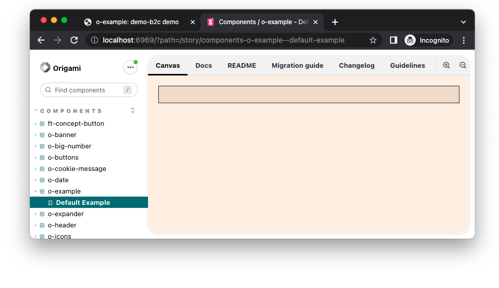
To run storybook locally run npm run storybook from your root directory. This will start a localhost server automatically.
Styles
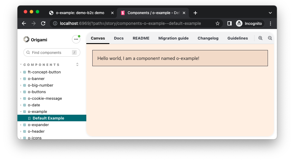
Once the storybook dev server is running we notice that some styles are already applied to our component. This is coming from o-example/stories/example.scss file which is imported by example.stories.tsx. example.stories.tsx is where we define our demos and its variants, controls and anything related to storybook demos.
Brands
When we were working on implementing brand variants for our component we noticed that our build server generated different html files for us and we could swap between them. In storybook we will need to restart our dev server and provide an environment variable. To start internal component demos in storybook you will need to run ORIGAMI_STORYBOOK_BRAND=internal npm run storybook and similarly for whitelababel you can run ORIGAMI_STORYBOOK_BRAND=whitelabel npm run storybook.
TSX template
npm run create-component generated a TSX (JSX + typeScript) boilerplate template as well.
The code in example.tsx will be very similar to what we have in demo.mustache but with different syntax:
// src/tsx/example.tsx

type ExampleProps = {
	theme: string
}

export function Example({theme}: {theme: ExampleProps}) {
	const classNames = theme ? `o-example o-example--${theme}` : 'o-example'
	return (
		<div id="element" className={classNames} data-o-component="o-example">
			Hello world, I am a component named o-example!
			<span className="o-example__counter">
				You have clicked this lovely button <span data-o-example-current-count>0</span> times.
				<button className="o-example__button">count</button>
			</span>
		</div>
	)
}
But let’s break this down a bit and compare it to the demo.mustache file.
- First thing we notice is
ExamplePropstype declaration for our component props. This type declaration is used to make sure that our component is given an object argument with athemeproperty of type string. - Second thing we notice is that we are using the JSX syntax to write our component and return it from the
Examplefunction. - Syntax for JSX and Mustache are slightly different. In JSX we use
classNameinstead ofclassand we are passing theme prop to our JSX using literal string (${theme}) syntax.
While working with different brands you might encounter examples where certain variations/themes are supported in one brand but not in another. For example o-message Action message supports internal and whitelabel brands but not core. In this kind of situation create brand specific folders inside the stories directory and our storybook configuration will take care of the rest. Example directory structure:
stories/*.stories.tsx - stories for all brands
stories/[brand]/*.stories.tsx - stories for a specific brand
stories/shared/.tsx - exports stories for re-export to support multiple specific brands (no .stories extension)
If your component supports only one brand you don’t need a brand specific stories directory structure for this, since origami.json will make our storybook configuration aware that there is only one brand and it will skip builds for other brands.
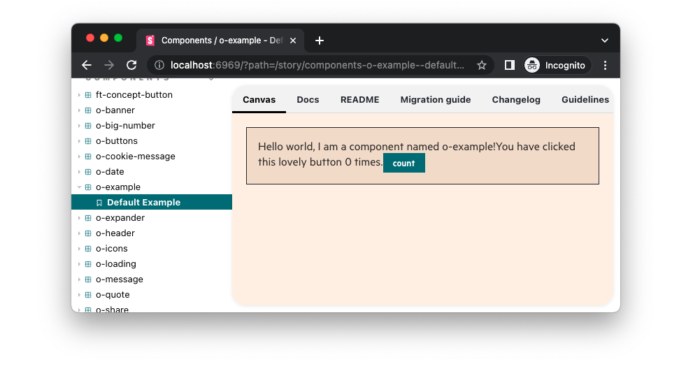
Adding button
Our demo is missing the count button and it’s related sentence. When we discussed browser support we decided to display count functionality if JS was enabled. In this case we have written a TSX template but never initialised components javascript. To do so we will need to update our example.stories.tsx file by adding the following code:
// stories/example.stories.tsx

+ import {useEffect} from 'react';
+ import javascript from '../main';
// ....

- const ExampleStory = args => <Example {...args} />;
+ const ExampleStory = args => {
+	 useEffect(() => {
+		javascript.init()
+	 })
+	 return <Example {...args} />
+ };
// ....
First of all we will need to import useEffect hook from React. Component TSX templates aim to make no framework assumption, so Origami users can benefit from templates in production whilst using other frameworks such as React. Our Storybook demos on the other hand are private and are not included in other projects, these are written specifically in React. Initialising component javascript with useEffect should display the count button and number of times it was clicked.
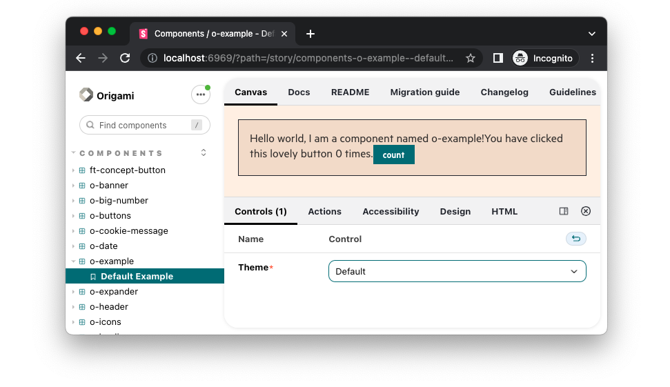
Theming
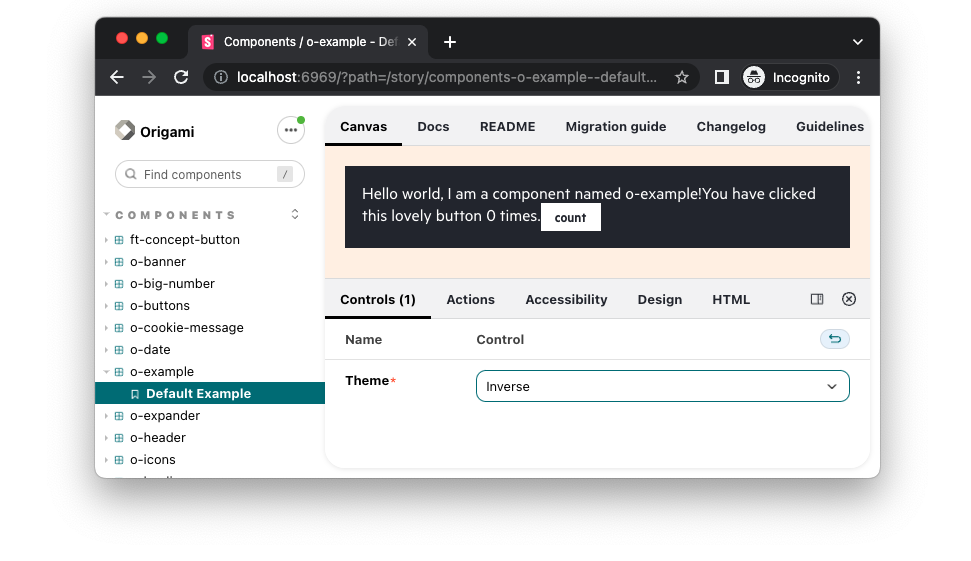
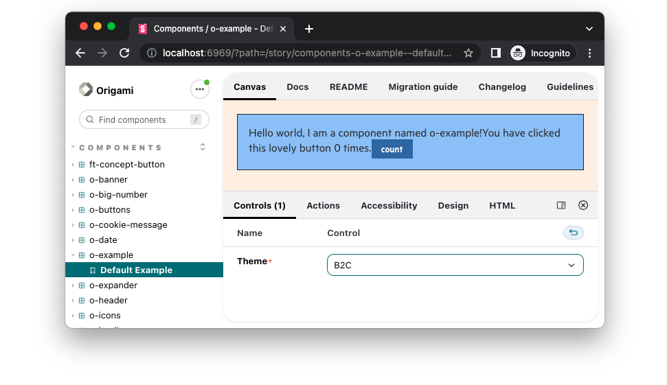
We already discussed how to run different brands in storybook but we still need to cover the theming part. This is the area where storybook really starts to shine. We provided theme as a prop for our JSX component and it would be amazing if we had a drop down where we could select a theme and immediately see how certain themes effect our component.
The code below dynamically creates labels and options for correct brand. We use Storybook controls to make theming easier, have better demos where experimenting is easier and developers can integrate correct version of component into their code. The code below dynamically creates labels and options for the current brand. We use Storybook controls to have better demos where experimenting with component options and content is easier, allowing developers and designers to integrate Origami in their project.
// stories/example.stories.tsx

// ....
export const DefaultExample: ComponentStory<typeof Example> = ExampleStory.bind(
 	{}
);

+ const themeOptions: string[] = ['', 'inverse']
+ const controlLabels: Record<string, string> = {
+ 	'': 'Default',
+ 	inverse: 'Inverse',
+ }
+
+ const Brand = process.env.ORIGAMI_STORYBOOK_BRAND || 'core';
+
+ if (Brand === 'core') {
+ 	themeOptions.push('b2c')
+ 	controlLabels.b2c = 'B2C'
+ }
+ DefaultExample.argTypes = {
+ 	theme: {
+ 		name: 'Theme',
+ 		options: themeOptions,
+ 		control: {
+ 			type: 'select',
+ 			labels: controlLabels
+ 		}
+ 	}
+ }
Implementing the above code should give us an option to choose between themes and apply them immediately once selected.
Part six: Storybook
In part six we learnt how to make a storybook demo for o-example component, covering:
- How to start storybook server for development for different brands.
- What are TSX template and how to write them.
- Initialising component JavaScript in React.
- Using storybook controls to demo theming for the component.
In part seven we’ll look at writing tests for our component. Continue to part seven.